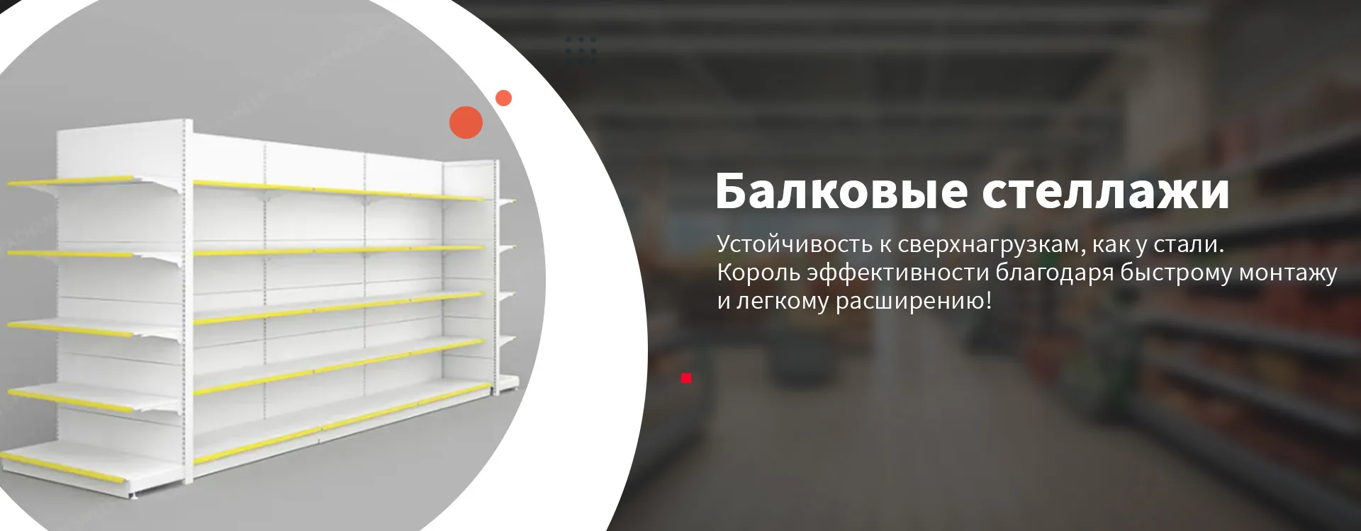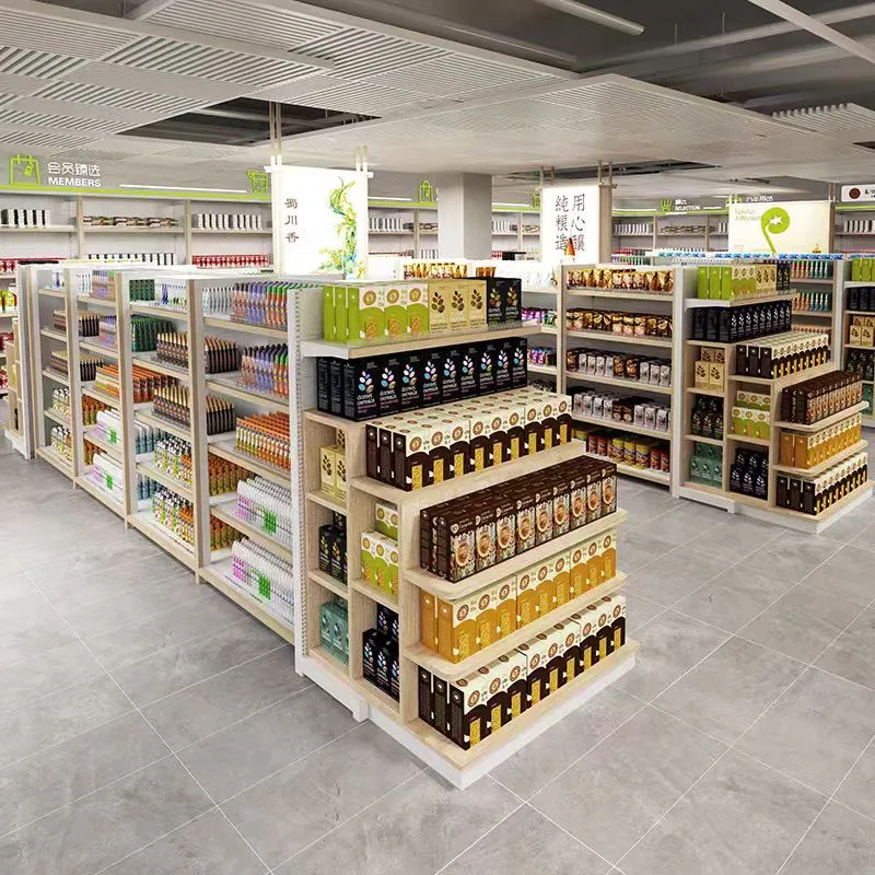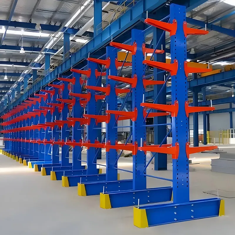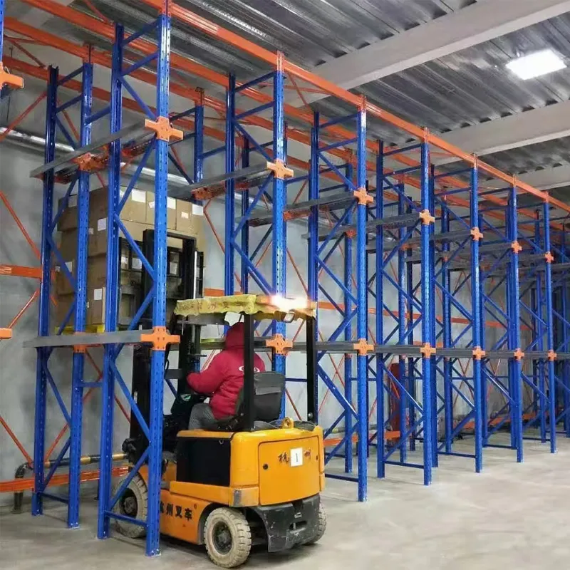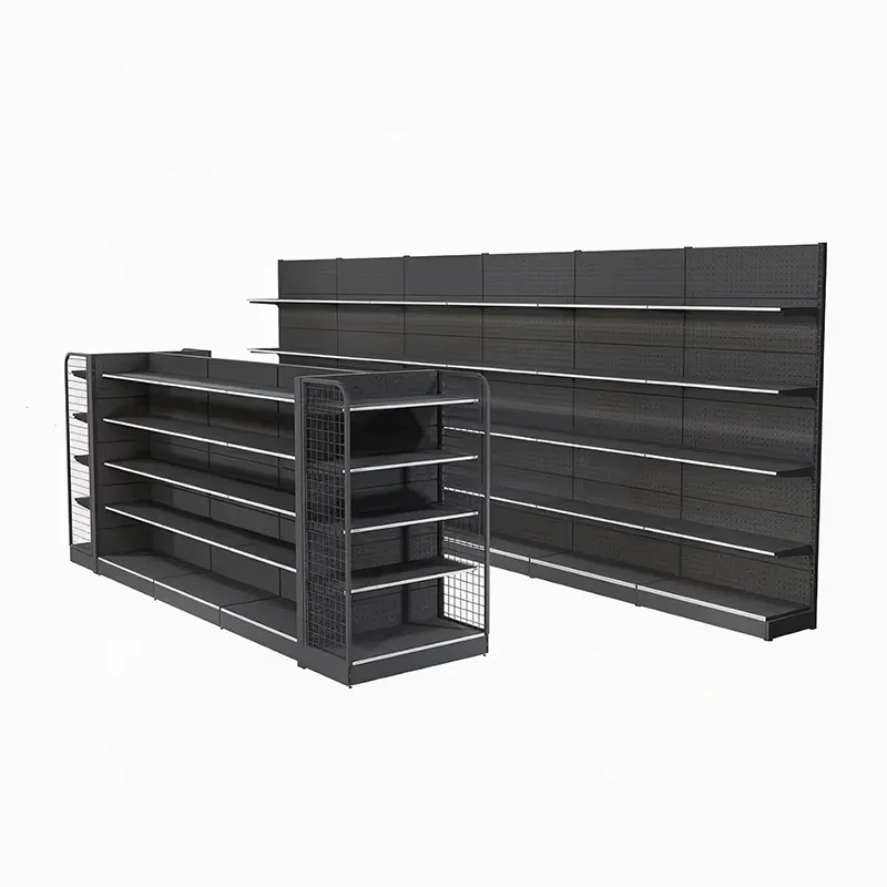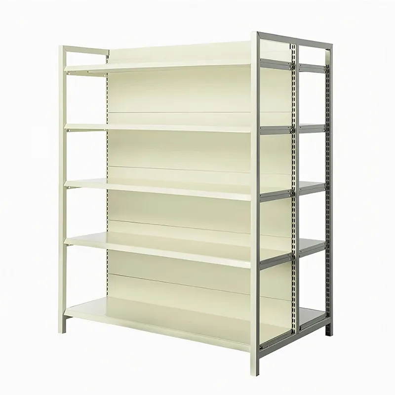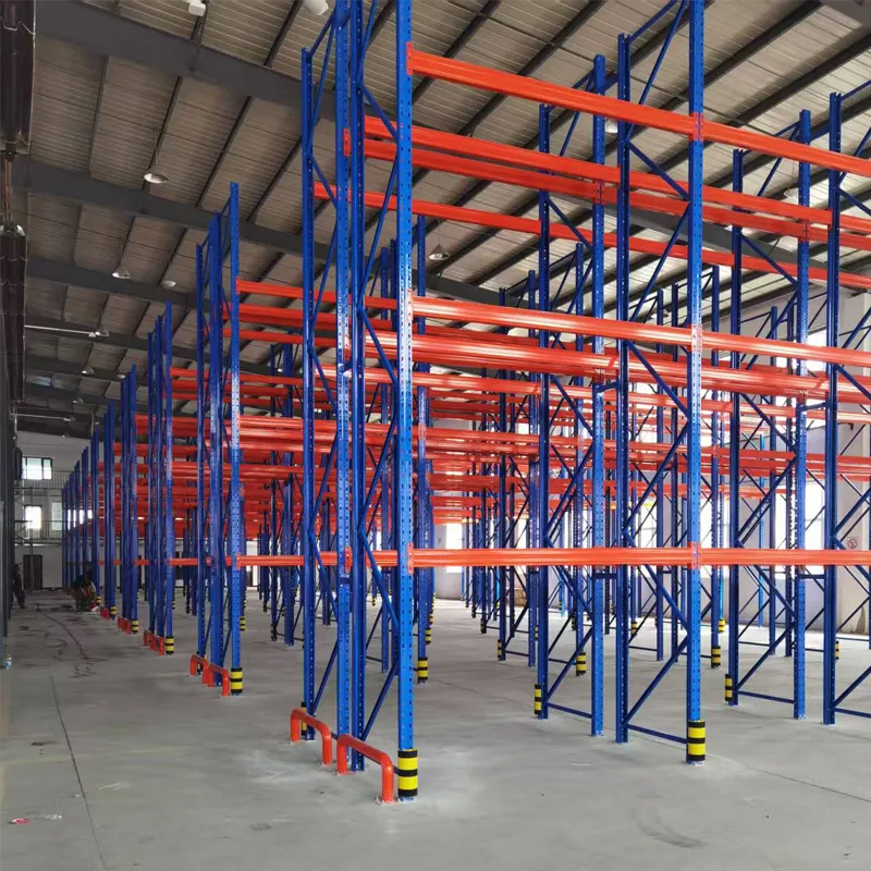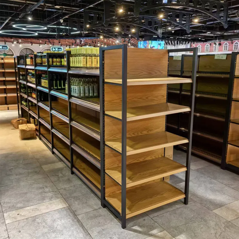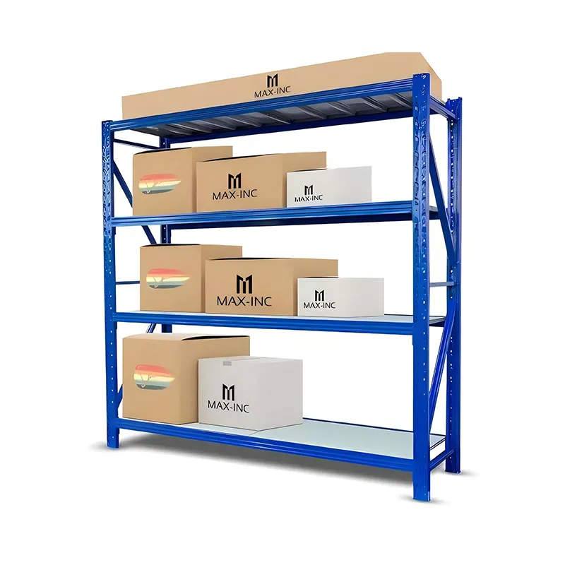
When people talk about layout principles, many people immediately imagine beautiful pictures from merchandising textbooks - perfect pyramids, perfect blocks of color. But in reality, in the supermarket at eight in the morning, when you need to quickly fill the empty shelves after the night's sales, these pictures fade. The main principle that I have learned over the years of work is that the display should work for sales here and now, and not just please the manager’s eye. And the basis of everything is the racks themselves. Their design dictates more than it seems. For example, I look at the shelving in our hall - some of them are from local manufacturers, and some are heavier and modular designs fromHarbin Jusheng production of metal structures. The difference is noticeable: on their racks, the shelf does not bend under the weight of cans of canned food, which means you can take a chance and make a denser, more voluminous display, which directly affects the principle of “maximum presentation of the assortment.”
I’ll start with, perhaps, the most fundamental thing, which is often forgotten when planning a display. All these principles - “facing the buyer”, “from heavy to light?” — depend on the physical capabilities of the equipment. You can't stack five rows of heavy bottles of cooking oil on a shelf designed to hold 30kg, no matter how much the planogram wants you to. I saw an entire section of a nearby store collapse because of this. Therefore, my first step in any department is to evaluate not the product, but the rack. What is its carrying capacity? What's the depth? Are the shelves adjustable? Without this, all talk about principles is empty words.
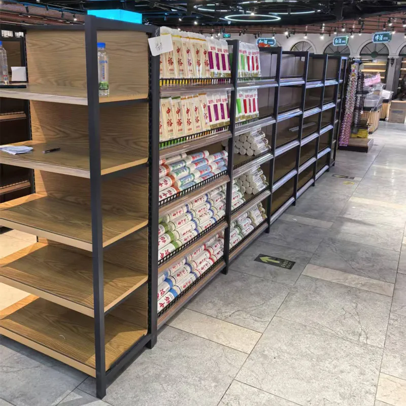
Here I remember my experience working with systems from a company whose website I studied -https://www.jshj.ru. In the description, they position themselves as a full-cycle enterprise, from design to service. And this is the key point. When a rack is designed specifically with retail purposes in mind, and not just as a metal structure, it changes things. For example, their retail shelving often has more frequent attachment points for shelves, allowing for flexibility in changing the height of sections. For display, this is gold. Today you have a promotion for tall bottles of kvass - I raised the shelf. Tomorrow I need to put out the flat boxes of cookies - I lowered them and made more rows. This is the practical embodiment of the principle of flexibility and adaptability of layout.
Here’s a common mistake: trying to display both groceries and household chemicals on a standard rack with equal spaces between the shelves. It turns out that there is plenty of space for cans of peas, but for large packages of washing powder - right next to each other, and they stick out, looking not “face-on”, but “sideways”. The principle of vertical display (grouping products of the same category into a column) simply does not work in such a situation. Therefore, now, when ordering new equipment, for example, for the drinks department, we immediately include different heights of sections in one rack. Information from the siteLLC ?Harbin Jusheng?The fact that they are engaged in design just suggests that with such a company you can discuss not just a purchase, but the development of a shelving system for the specific tasks of displaying a particular supermarket.
Everyone knows about the “golden shelf” — buyer's eye level. Standard advice: go there for high-margin products or those that need to be promoted. But life makes adjustments. Firstly, ?eye level? a man with a height of 190 cm and a woman with a height of 160 cm are two different shelves. We once conducted an experiment: we placed it on one “golden” one. shelf by standard standards is a new expensive sauce, and on the shelf above, which was “golden”? for taller people - similar, but cheaper. Surprisingly, the cheap one sold better at this point. It turned out that in that department, men shopped more often and looked into the cart less often.
Secondly, this principle is dead without proper lighting. You can put the most beautiful product in the best position, but if the lamp above the shelf burns out or the lamp glares on the packaging, there will be no sales. The design of the rack should allow the light to be installed correctly. Sometimes you see racks where the cross beam casts a shadow exactly on the middle shelf, killing all of its “golden” shelf. essence. When choosing equipment, it’s probably worth looking at companies that understand this integration, like the sameHarbin Jusheng, which, judging by the description, produces both beam and shelf systems - different types interact with light differently.
And one more nuance - a children's area. The classic principle of ?eye level? it works the other way around. ?Golden shelf? for a child these are the lower tiers. And if the shelves are not adjustable, or their edges are not safe (sharp corners), then there can be no effective display of toys or children's snacks. This is to the question that principles are not dogma. Sometimes you have to break the mold based on the audience.
One of the key principles is creating the effect of abundance. An empty shelf doesn't sell. Hence the desire to put the product on display? and in depth. But here the main enemy lies in wait for us - excess inventory on the trading floor. I laid out 10 rows of yogurt instead of 5. The display case looks great, but turnover is falling, and losses from expiration are increasing. We need to find a balance.
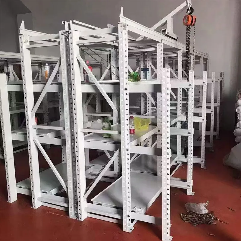
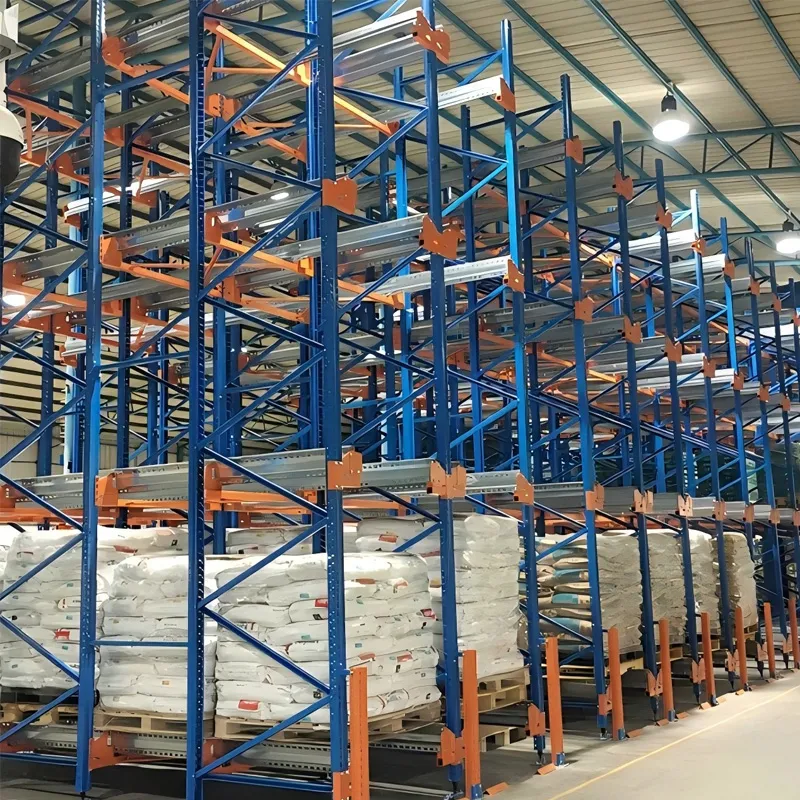
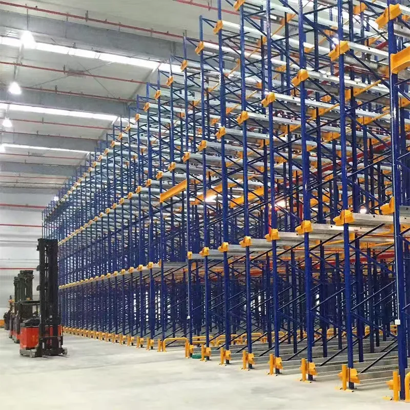
I think the solution often lies in the shelving design. For example, the use of racks with pull-out pallets or “shuttle” type systems, which are mentioned in the assortmentshelving plant ?Jusheng?. Such systems allow you to store the main stock in the depths of the structure, and maintain a dense, but not excessive display on the front part. The principle of “first in, first out”? (FIFO) is respected automatically. This is no longer just a display, it is the integration of logistics and merchandising. In our standard shelf racks, we are forced to use tricks: we put in the depths not real goods, but empty dummy boxes, and “working” ones. We keep the stock on the top tier for quick replenishment.
I had a disastrous experience with canned food. We decided to make a deep display in three rows to create a wall of cans. There was an effect, but when it came time to rotate the goods with new deadlines, I had to unload the entire shelf. Three hours of work by two loaders and complete chaos in the department. After that, for heavy and piece goods, we adopted the principle of “one row deep, but more vertically.” Once again, the question comes down to the shelving: is there enough height and strength to build a vertical column of heavy cans?
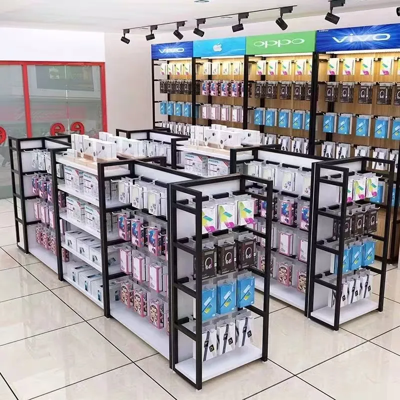
Display principles often outline ideal customer journeys. But people walk around the store chaotically. However, there are points that always work. This, for example, is the area near the cash register or the “grandfather zone?” - dead-end places at the end of the shelves. Impulse goods work well there. But its display requires special solutions - often these are not standard shelves, but special displays or baskets. And here it is important that the additional equipment is combined with the main shelving stylistically and in quality. Mismatched designs create a feeling of chaos.
Grouping by categories would seem to be the basics. But there is a trap here too. We group all the sauces together. A buyer looking for tomato paste passes by mayonnaise, ketchup, and horseradish. There's a chance he'll take something else. But on the other hand, if he only wants pasta, he is forced to scan the entire long shelf. Sometimes cross-layout works more effectively: the same mayonnaise is next to the eggs in the refrigerator, and the kebab sauce is in the meat department on a special satellite rack. This requires more compact, mobile or built-in shelving units. Possibility to order different types of systems (shelf, console) from one supplier, likeJusheng, makes it easier to create such a holistic environment.
I remember the incident with tea and coffee. They were always posted together. But the analysis showed that tea buyers rarely buy coffee, and vice versa. They were distributed to different ends of the grocery department. Sales did not fall, and the flow of people in the department became more uniform, and the crowding at one point decreased. Sometimes violating the principle of grouping by product for the sake of grouping by consumer produces results.
This is perhaps the most unspoken principle. The display must be safe for the buyer and for the employee who carries it out. Sharp corners, unstable pyramids of cans, overloaded top shelves are a direct threat. I always pay attention to the quality of the processing of the edges of the shelves and the reliability of the fastenings. When you see neat welds and thick metal, like on some industrial designs, you understand that they thought about this too.
Ergonomics for a merchandiser is also a principle. If a stepladder is needed to replenish items on the top shelf every time, and the shelves do not extend, the employee will involuntarily avoid this operation, and the shelf will be empty. The ideal system makes it easy to service all areas. The description that the company from the website jshj.ru also provides after-sales service suggests that they can provide advice on the ergonomic operation of their systems, which directly affects the quality and timeliness of display.
As a result, all the principles of display on supermarket shelves are not a set of laws, but tools. Their effectiveness depends 50% on who uses them and how, and the other 50% on the “tools,” that is, on the racks themselves. Robust, well-thought-out, flexible systems like those developed byHarbin Rack Factory ?Jusheng?, do not solve merchandising problems on their own, but they create that very reliable foundation on which you can build a competent display, experiment and find your own principles that work specifically in your hall. Without this foundation, any, even the most correct ideas, risk collapsing like that overloaded shelf with canned goods.